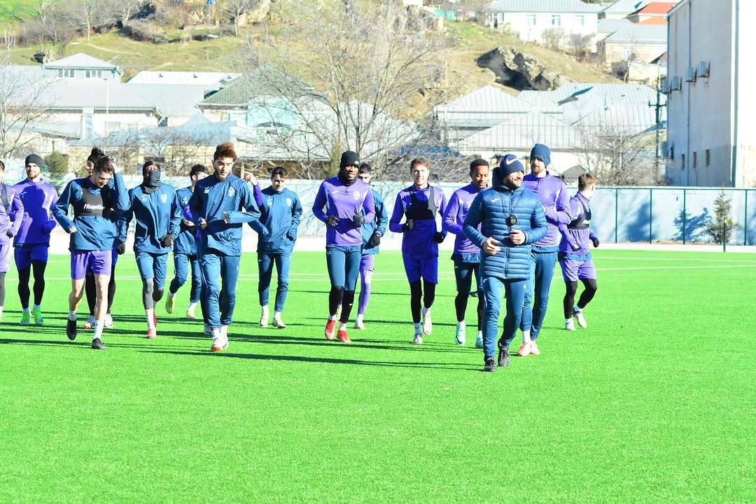
After 20 years, "Neftchi" presented its new logo to the public, which was modernized for the fifth time in its history.
"Sabah", another representative of the capital, took the same step. Masazir club also updated its logo.
Many liked the work of Sabah. However, the logo of "Neftchi" became a topic of discussion. There were even those who said that the work done was not suitable for the price.
I wonder how the new logos of both clubs were bought? We turned to graphic designer Mahin Hajizade for his opinion on the work. An employee of "Codelandia" company told Offsideplus.az:
"The old logo of "Neftchi" was more confused and complicated. In the new work, this has been eliminated and a more minimal, modern design has been achieved. In my opinion, although not ideal, it is better than before. In modern times, logos are moving towards minimalism. It fits the style. If the price is as stated, it is expensive.
"Sabah"s old logo was satisfactory on the whole. However, in the new version, meanings have been added, and redundant elements have been removed. For example, like the soccer ball icon and the text "football club" working together. Each element shown and explained has a good cohesion."